The Virtue of Visual Silence: Designing Spaces That Ask Nothing of You
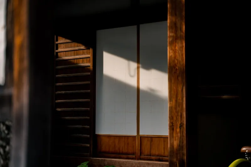
The Exhaustion We Don't Acknowledge
Consider the last time you entered a space and felt nothing was required of you. No feature demanded your admiration. No surface competed for your attention. No curated detail announced itself as worthy of notice. If you are struggling to recall such a moment, the difficulty is itself instructive.
American environments—commercial, residential, and civic alike—have become relentlessly demanding. Restaurants layer exposed brick against Edison bulbs against hand-lettered chalkboards against reclaimed wood. Office lobbies deploy installations, branded graphics, and feature walls that perform corporate identity at full volume. Even homes, under the influence of social media aesthetics and renovation television, have come to function as sets—spaces designed to be seen and photographed rather than inhabited and rested in.
The result is a form of environmental fatigue that most people experience but few name. We are exhausted by our own buildings. And the solution, counterintuitively, is not more sophisticated stimulation. It is restraint.
What Boredom Actually Offers
The word "boring" has become, in American design culture, one of the most damning criticisms a space can receive. This is a relatively recent development, and a revealing one. For most of human history, the built environment was understood to provide a stable, predictable backdrop against which human activity could unfold. The room was not the event. The room was the condition for the event.
Cognitive science offers a useful corrective to our contemporary bias against visual quiet. Research on the relationship between environmental stimulation and creative cognition consistently finds that moderate, predictable environments—spaces that do not demand continuous attentional processing—are associated with higher rates of spontaneous thought, creative ideation, and what psychologists call "default mode network" activity. This is the neural state associated with daydreaming, reflection, and the integration of experience. It is, in short, the state in which the mind does some of its most important work.
Spaces that overstimulate suppress this mode. They keep the brain in a reactive posture, processing and responding to environmental input rather than generating internal thought. The irony of designing for stimulation is that it may actively undermine the very creativity and engagement it seeks to inspire.
The Japanese Principle of Restraint
Japanese architectural and aesthetic philosophy has a long and sophisticated engagement with the idea of visual quiet. The concept of wabi—often translated, inadequately, as "rustic simplicity"—describes a quality of beauty found in understatement, in the unfinished, in the ordinary. The tea house, perhaps the purest expression of this aesthetic in architectural form, achieves its effect not through elaboration but through its opposite: the careful removal of everything that is not essential.
The walls of a traditional Japanese tea room are not blank from inattention. They are blank from discipline. The single scroll in the alcove, the single flower arrangement, the carefully considered texture of an unadorned surface—these are not the products of minimalism as a style but of a philosophical commitment to the idea that restraint is itself a form of generosity. It gives the visitor's attention somewhere to rest.
Toyo Ito's own design philosophy engages with this tradition while remaining responsive to contemporary conditions. The goal is not the reproduction of historical forms but the recovery of the underlying principle: that a building can serve its occupants most fully when it does not insist on being the most interesting thing in the room.
What American Design Gets Wrong About Interest
The American tendency toward stimulative environments rests on a conflation of interest with value—the assumption that a space which commands attention is more worth inhabiting than one which does not. This conflation runs deep. It shapes the decisions of developers, the preferences expressed in surveys, the editorial choices of design publications, and the aspirations of homeowners who have absorbed, through years of media exposure, the idea that a beautiful home is one that photographs well.
Photography, it turns out, is a poor guide to architectural quality. The camera rewards contrast, texture, color, and the kind of visual complexity that reads clearly in a two-dimensional image. It is largely indifferent to the qualities that make a space genuinely livable: acoustic calm, proportional ease, the sense of being held without being enclosed, the capacity to recede into the background when the life being lived within it is the point.
Commercial design has followed the same logic with even greater intensity. The American retail environment, the branded restaurant, the experiential hotel lobby—all of these are designed for the photograph, for the social media post, for the moment of first impression. They are not designed for the hour spent within them, or for the quality of thought and feeling that hour might sustain.
Designing for the Long Inhabitation
The alternative is not austerity. It is not the elimination of beauty or the embrace of institutional blankness. It is, rather, a different relationship between the space and the person within it—one in which the space serves rather than performs.
In residential design, this means surfaces chosen for their quality under sustained attention rather than their immediate impact. A plaster wall whose texture reveals itself slowly over time. A wood floor whose grain becomes familiar through daily crossing. A window whose proportions frame the exterior world without commenting on it. These are not boring choices. They are choices that reward long habitation, that become more rather than less satisfying over time.
In workplace design, the principle argues for environments that support sustained concentration rather than broadcasting organizational identity at every surface. The open workspace festooned with brand colors, motivational typography, and curated cultural artifacts may signal vitality in a recruitment brochure. For the employee spending eight hours within it, attempting to think clearly and work well, it may be a source of chronic, low-level cognitive strain.
In public architecture—libraries, civic centers, transit hubs—the case for visual restraint carries particular weight. These are spaces that serve an enormous range of people across an enormous range of emotional states. A library that does not demand attention is a library that can hold a grieving person, a distracted student, a tired commuter, and a child discovering reading for the first time, all simultaneously and without imposing a particular mood on any of them.
The Radical Generosity of Quiet
There is something genuinely countercultural, in the current American context, about designing a space that does not ask for anything. That does not perform. That does not seek to be noticed or shared or remembered as an aesthetic experience. Such a space trusts the person within it to bring the interest. It assumes that human life, conducted within a calm and well-proportioned room, is sufficient. It does not feel the need to add.
This is, in the deepest sense, what the best architecture has always done. It has created the conditions for living without competing with the living itself. The spaces we remember most vividly—the ones we return to in memory when we need to feel held—are rarely the most visually elaborate. They are the ones that were quiet enough to receive us, and generous enough to let us be.