Designed to Be Seen: The Hidden Grammar of Architectural Attention
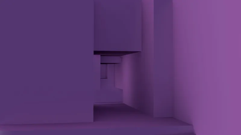
Walk into any room and something will claim your eyes first. It may be a band of afternoon light falling across a concrete wall, or the unexpected depth of a corridor that extends beyond what you anticipated. It may be nothing more than a change in ceiling height—a compression followed by release—that arrests your movement for a moment you cannot quite explain. Whatever the stimulus, the experience is rarely accidental. Architects have long understood that space is not a neutral container. It is an instrument of perception, tuned to direct awareness with the same deliberateness that a composer uses silence to make a note resonate.
This is the architecture of attention: the set of spatial decisions that determine what a building asks you to look at, what it allows you to overlook, and how it shapes the quality of consciousness you bring to the act of simply being somewhere.
The Sightline as Editorial Choice
In architectural practice, the sightline is among the most fundamental tools of perceptual control. A sightline is not merely a line of vision; it is a choice about narrative. When a designer positions an opening, frames a view, or orients a staircase toward a particular wall, they are making an editorial decision about what the occupant's story will include.
Consider how this operates in civic architecture across American cities. The long axial corridors of neoclassical courthouses and libraries were not designed simply for efficient circulation. They were designed to produce a specific psychological condition—one in which the individual feels oriented toward something larger than themselves, drawn forward by a vanishing point that implies consequence. The sightline performs authority. It tells you, before a single word is spoken, that this place has a purpose and that you are moving toward it.
In residential design, the same principle operates at a more intimate scale. A kitchen positioned to look out over a garden does not merely offer a pleasant view; it integrates the rhythms of the natural world into the rhythm of daily domestic life. The designer who frames that view has decided that the garden deserves attention—that it is worth interrupting the task of cooking to notice the quality of light on a particular afternoon.
Contrast as a Mechanism of Emphasis
If sightlines direct attention through orientation, material and tonal contrast direct it through differentiation. The human visual system is, at its most fundamental level, a contrast-detection apparatus. We notice edges, transitions, and discontinuities. Architects who understand this exploit contrast not for decorative effect but as a precise psychological instrument.
A single column of rough-hewn stone set against a smooth plaster wall does not merely create visual interest. It creates a hierarchy. The eye moves to the anomaly, registers its texture, and uses it as an anchor for understanding the room's broader spatial logic. The contrast tells us: this element is significant. Pay attention here.
This principle explains why so many celebrated American interiors—from the brick-and-steel lofts of converted industrial buildings in cities like Chicago and Pittsburgh to the timber-and-glass mountain retreats of the Pacific Northwest—feel so legible to the people who inhabit them. The material contrasts are doing cognitive work. They are organizing perception, creating a kind of visual punctuation that allows the occupant to read the space rather than simply occupy it.
The inverse is equally instructive. Spaces defined by excessive uniformity—identical surfaces, unvarying finishes, ceilings that offer no change of plane—tend to produce a diffuse, slightly fatiguing experience. Without contrast, the eye has nowhere to rest and nothing to prioritize. Attention, finding no anchor, begins to drift.
Spatial Hierarchy and the Choreography of Presence
Beyond sightlines and material contrast, architects shape attention through the deliberate orchestration of spatial hierarchy—the careful calibration of scale, proportion, and sequence that tells an occupant which spaces are primary and which are subordinate.
This hierarchy is felt before it is understood. Moving from a compressed entry vestibule into a generous, light-filled living volume, the body registers the transition as significant. The nervous system responds to the expansion of space with something close to relief, and in that moment of relief, attention sharpens. The arrival is experienced as an event. The room earns its status not through ornamentation but through the contrast it provides with what came before.
Toyo Ito's architectural philosophy has long engaged with this dynamic—the idea that space is not experienced statically but as a sequence of conditions, each one modifying the perception of the next. A building that understands this choreography can guide a person through a range of attentional states: alert and focused in some rooms, expansive and contemplative in others, quietly absorbed in the texture of a material detail in a transitional corridor.
In the American context, where domestic and civic spaces are often designed for maximum flexibility and minimum formal commitment, this kind of intentional hierarchy can feel radical. It requires designers to make strong claims about what matters—and to trust that those claims will serve the people who live and work within them.
What Fades Into the Background
Equally important to what a building foregrounds is what it allows to recede. Not every surface should compete for attention. Not every element should insist on being noticed. The background is not a failure of design; it is one of design's most sophisticated achievements.
Spaces that are universally demanding—where every surface is articulated, every material is assertive, every corner presents something to process—produce a particular kind of exhaustion. The occupant cannot settle. The environment offers no permission to let the mind wander, to be only partially present, to exist in that productive half-attention that so much genuine thinking requires.
The most enduring spaces tend to offer a carefully negotiated balance: foreground elements that reward focused attention, and background conditions that support a quieter, more diffuse awareness. A room that achieves this balance feels simultaneously stimulating and restful—a combination that is, in practice, extraordinarily difficult to produce and immediately recognizable when encountered.
Designing for Awareness
For architects and designers working in the American built environment today, these principles carry practical weight. The proliferation of open-plan offices, mixed-use residential towers, and multipurpose civic spaces has created a landscape in which the grammar of attention is frequently neglected—not out of malice but out of a prioritization of flexibility over perceptual intentionality.
The cost of this neglect is not merely aesthetic. Research in environmental psychology consistently demonstrates that spatial disorientation and perceptual overload are associated with diminished cognitive performance, elevated stress, and reduced capacity for the kind of sustained engagement that meaningful work and genuine rest both require.
Designing with attention in mind means asking, at every stage of the process, what this space is asking its occupants to notice—and whether that request is one they can reasonably honor. It means treating sightlines, material transitions, and spatial hierarchies not as stylistic preferences but as ethical commitments to the people who will inhabit the finished work.
A building that knows what it wants you to see is a building that respects you. It has done the difficult work of deciding what matters so that you do not have to make that decision alone, standing in a room that offers no guidance, waiting for meaning to arrive on its own.